A Visual Brand Language Tailored for the Laboratory Environment
Visual Brand Language
Iridian
Product summary
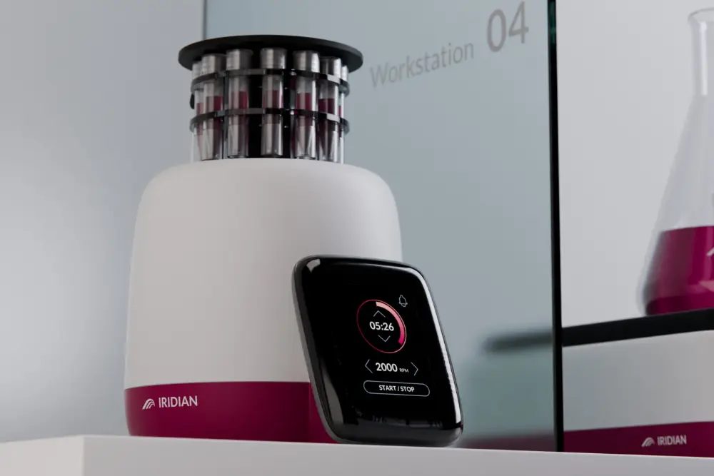
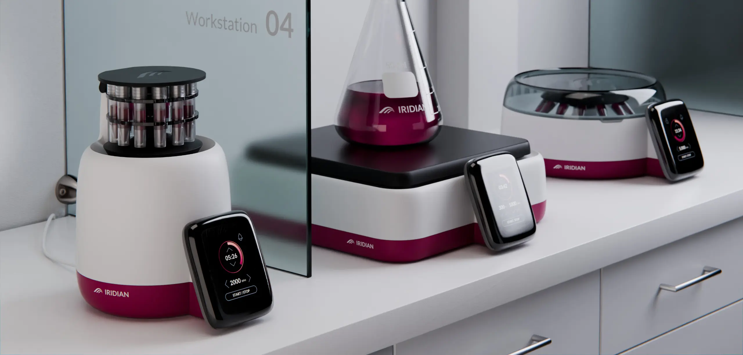
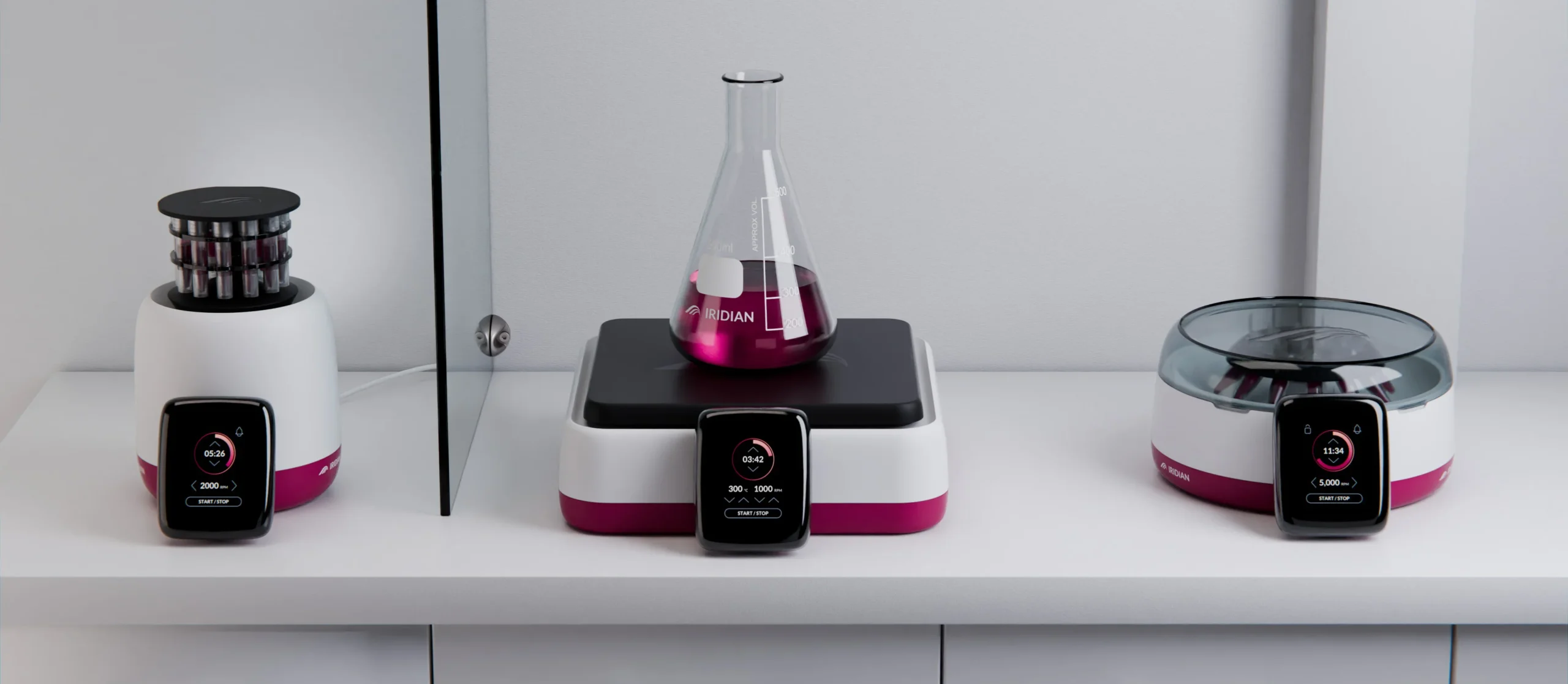
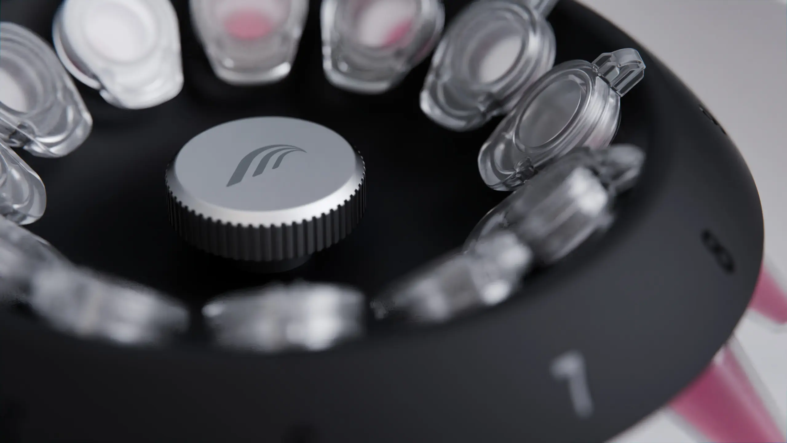
The Iridian visual brand language (VBL) brings together a range of laboratory equipment into an easily recognisable family. Using consistent elements like form, proportion, and colour distribution, the Iridian portfolio of products can be recognised from a distance without the need to see the logo.
Categories
Laboratory Equipment Design, Medtech Design, Design Strategy, Visual Brand Language
Visual Brand Language Flexibility for Differing Manufacturing Processes
Developing an aesthetic style that works across multiple products requires a lot of consideration. For companies with a large portfolio of products, a potential hurdle can be differences in the manufacturing process. For instance, a product made from injection moulded plastic vs a product made from sheet metal. This requires a visual brand language that is adaptable to different processes.
The Iridian visual brand language caters for differing processes. The design strategy provides a main guideline for all products, with additional sub-guides and flexibility dependent on the manufacturing process.
Visual brand languages and industrial design guidelines will vary depending on the company and brand. For many larger companies, a graphic design or brand guideline will already be in place, in this case, the visual brand language will focus on the application of the brand to its physical products. Other visual brand languages may look into a larger section of the brand covering 2D graphical elements and their application.
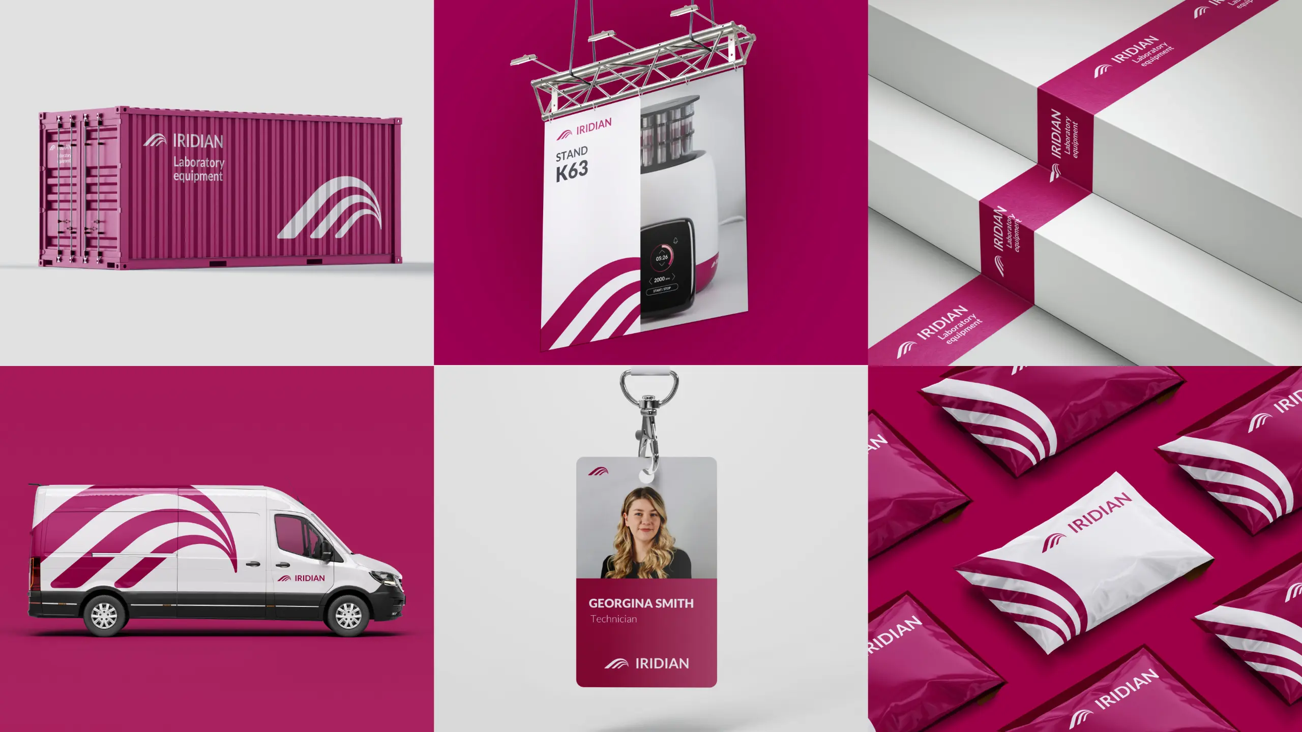
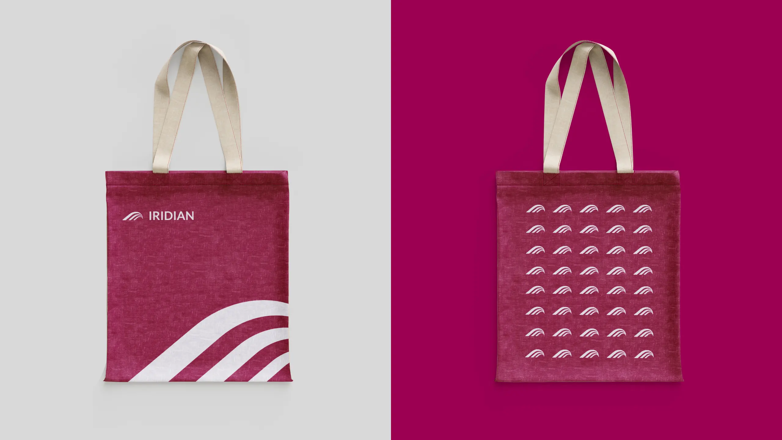
The Iridian visual brand language covers the whole brand landscape, including the logo design, brand colours, and application of the brand across various media. The design strategy varies subtly across different media to accommodate different processes and use cases. However, all media and product use cases still utilise the same overall unified design language, ensuring visual recognition and consistency.
The Iridian visual brand language can be broken down into a few main elements. While there are many elements to take into consideration these are some of the main ones.
Form Language
This is an often overlooked aspect of the many companies with multiple products. Tying products together with form creates an extra level of brand recognition. The Iridian form language uses minimal curved forms occasionally broken by sharper transitioning elements. Where the manufacturing process restricts the form language, alternative forms are used to maximise visual consistency.
Colour & Colour Proportion
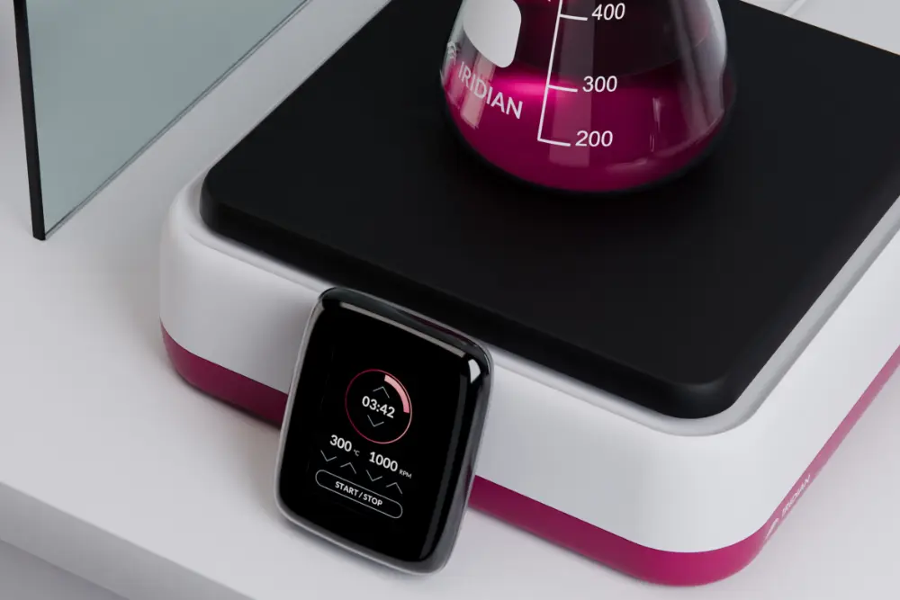
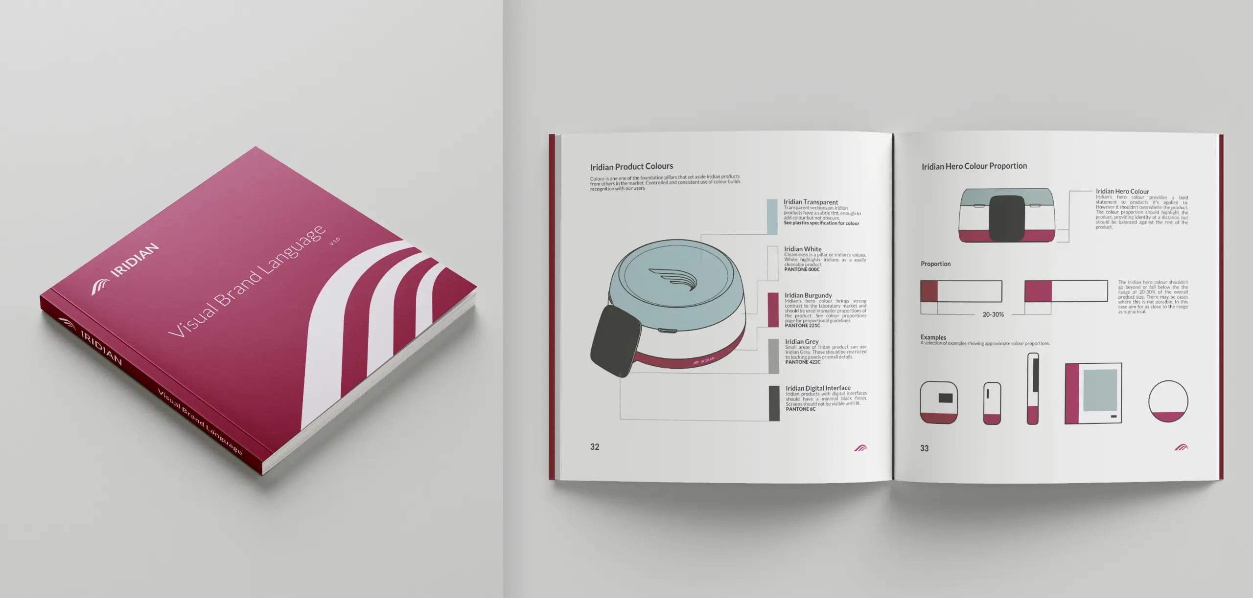
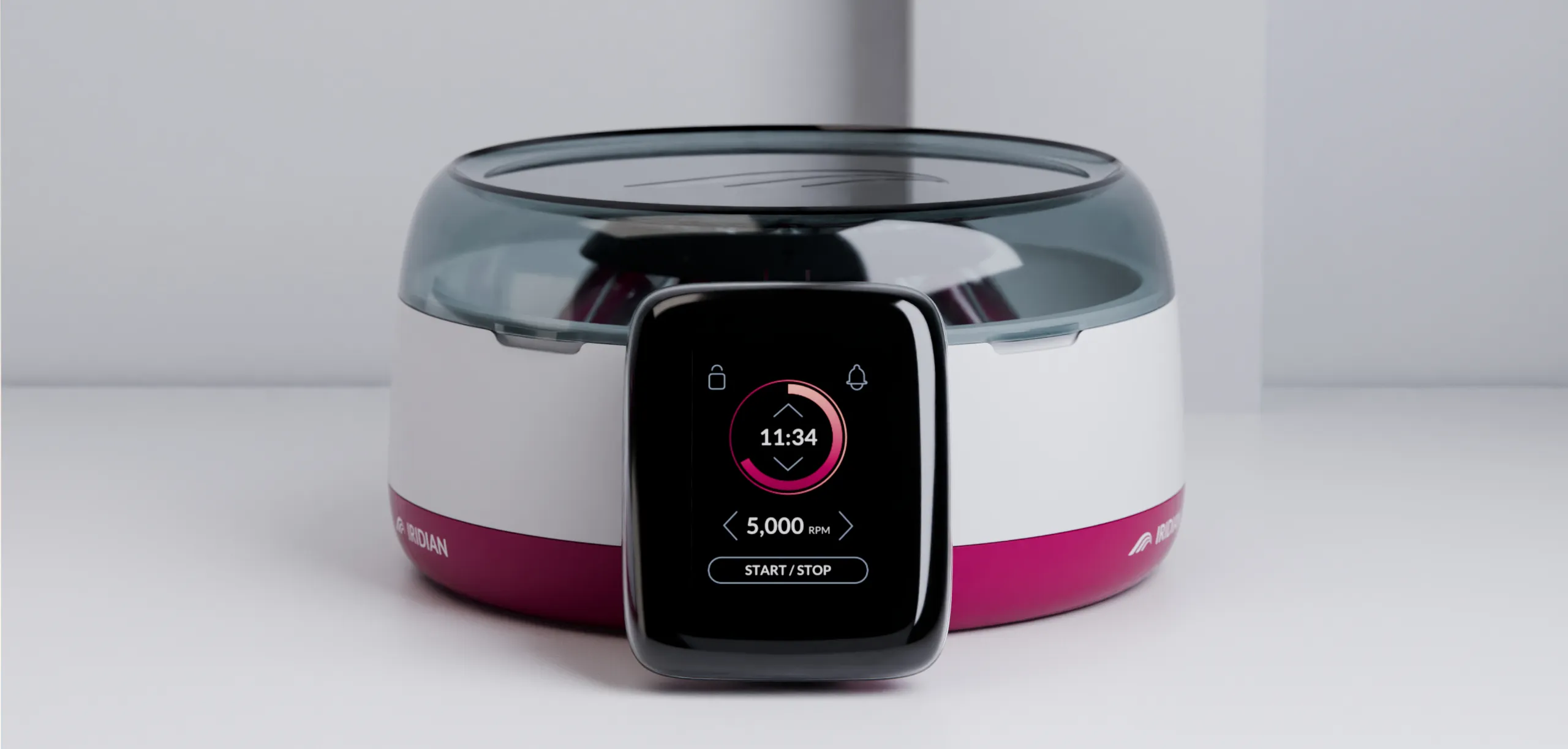
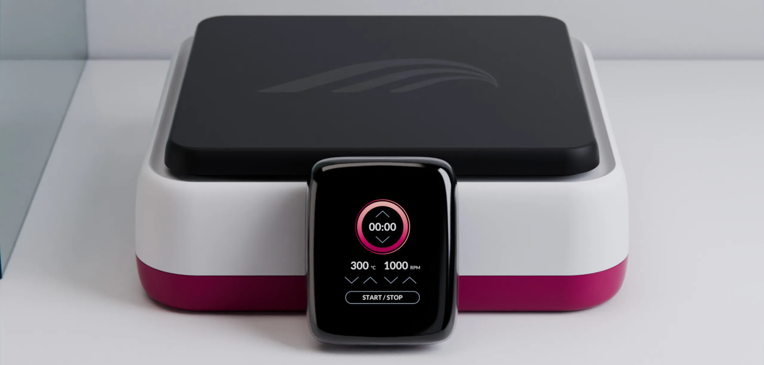
Iridian products all feature the main Iridian brand colour. The application of this colour targets a similar distribution throughout Iridian equipment, independent of size or shape. These guidelines vary between product types, for instance, Iridian laboratory equipment focuses on a ratio of approximately 30% brand colour to 70% white. Whereas some digital and print media have a higher ratio of the brand colour.
Logo Placement & Labelling
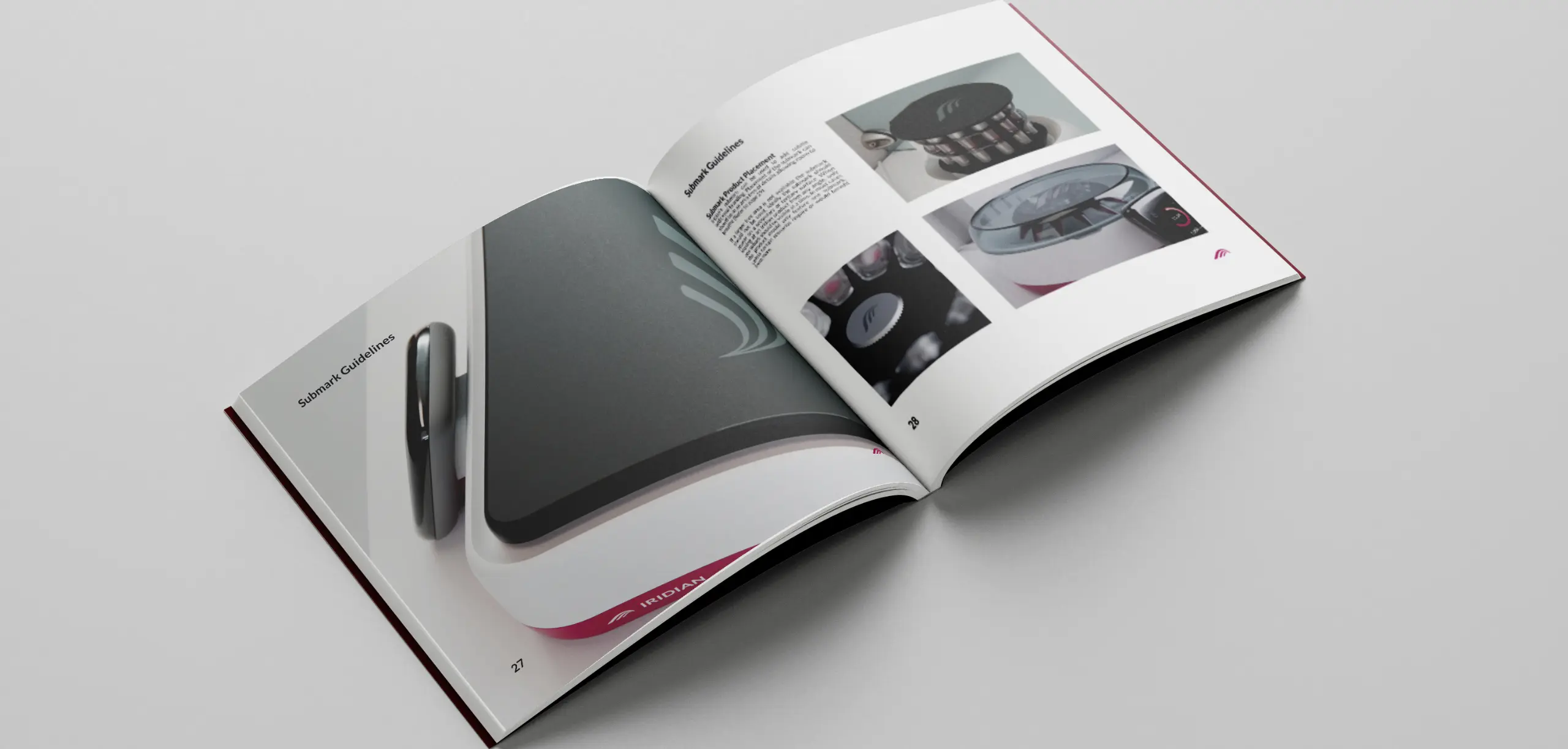
Iridian laboratory equipment uses a white logo backed by its brand colour. Applying the same guidelines to logo placement and usage on the Iridian brand colour ensures people will consistently see the same visual representation of the brand.
Interface & Touch Points
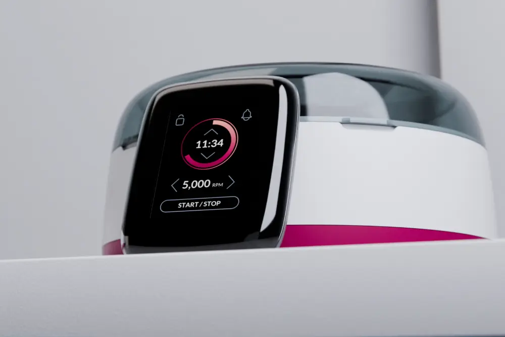
The UX and GUI for Iridian laboratory equipment use the same graphical elements and style across devices. Any touch point the user interacts with is carefully considered to provide the same experience. Moving from a visual brand language to an experience brand language.
Colour improves brand recognition by up to 80%.
User experience (UX) and the user interface (UI) are well-known parts of the digital design process, however, UX is equally important for physical products too. Any product that has an interface, whether digital or physical, requires design for user experience.
Creating a good user experience is essential for a successful product. When designing a visual brand language for multiple products, the user experience between those products should also be consistent. Using another product from a known brand should always have some familiarity with the user.
Iridian products with digital interfaces use the same iconography style and menu systems. This ensures that when someone interacts with one, the next product should feel familiar to use. Physical interfaces on Iridian products feature the same button styles and placement guidelines.

The importance of design strategy and a visual brand language
An introduction to the importance of a visual brand language and how it can create recognition and strengthen your brand.
Expand to read more
Reputation is a fundamental part of any business, how people form opinions of a company and brand is influenced by many factors. For companies selling physical products, one of the main influencing factors is the product itself. Generally, you want your users to know what brand of product they’re using. Sadly, many companies do this by applying their logo and nothing else.
Whilst this may inform a user what brand the product is from, providing they see the logo, it doesn’t build strong brand recognition. Imagine your product is placed in a room of products, and all of them look indistinctive apart from different logos. Unless the logo is quite large, which presents other issues visually, most people won’t know what brand each product is until they’re very close. What’s worse is that a user may use another company’s product and have a bad experience, then mistake it for your brand.
Instead, out of ten products in a room, you could instantly tell four came from the same brand, knowing this, you don’t even need to see the logo. You know without approaching or using the products that they’re related to each other. Even if initially you don’t know which brand it is, once you find out, you will instantly know the rest of the products are from the same company. As well as that, products that are visually recognisable from a brand perspective are perceived as being higher quality.
A visual brand language, sometimes called industrial design guidelines, is the solution to this. A visual brand language is the application of a design strategy built around the company and its goals.
The first step for the Iridian visual brand language was to develop a recognisable laboratory aesthetic while at the same time creating something that could be recognisable. The aesthetic was chosen for its flexibility with differing product sizes and shapes whilst still keeping the recognisable visual style and design elements.
Companies that value design outperformed industry benchmark growth by as much as two to one.
View More Medtech Case Studies
A selection of our medtech and laboratory equipment design work.
